
Timeless and iconic
Why I'm looking forward to the double arrow's second act
Designed in 1965 by Gerry Barney the double arrow is both an icon and iconic. It identified British Rail up to privatisation in 1997 but then stuck around, helping us to find the national rail station or service on countless signs and maps. It became one of the only points of continuity in the jumbled mess of logos, fonts and styles that was the UK’s rail system over this time. As twenty-odd brands competed to stamp their individual identities on their trains and stations, the double arrow was a small ember of hope that underneath it all there was still a coherent system, capable of one day being brought back together.
The time draws near. Not only are the disparate train operating companies being taken back into public ownership, there’s also a plan to end the chaotic and noisy proliferation of styles.
Margaret Calvert’s Rail Alphabet typeface has been given a 21st Century spruce up and is also appearing on both physical and digital signage across the country.
It’s pleasing to see stations on the network already starting to look like they’re part of something bigger.
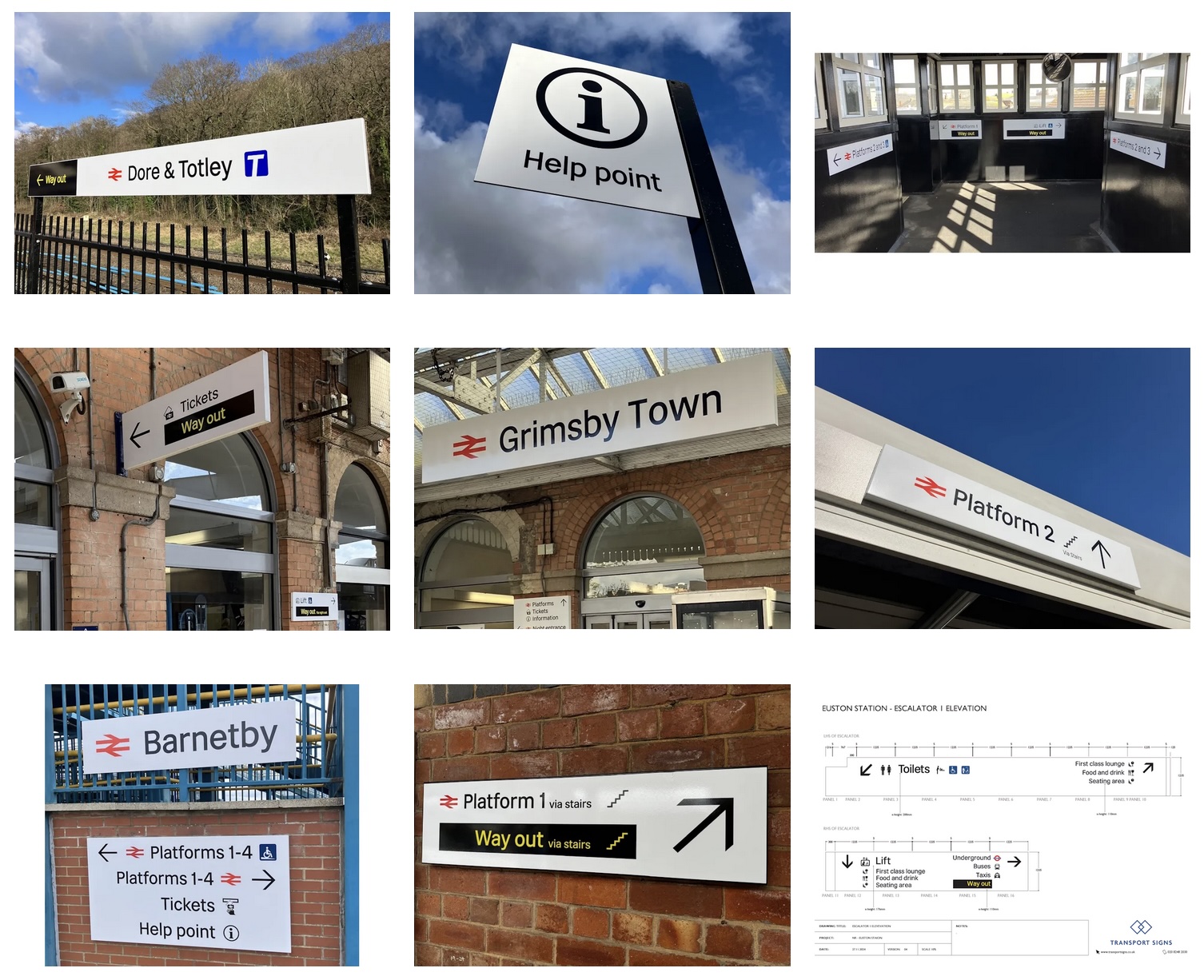
(Credit: Transport Signs)
It makes no sense for the platform number or the direction to the toilets being different in the north west of England compared to Greater London. The original Corporate Identity Manual found - through research - the best way to implement wayfinding in a national railway station in Great Britain and then made that available to all stations. With the effect that passengers feel, like I did growing up, that they could trust in this national network to reliably join up disparate places with clarity and predictability.
Journeys should feel simple. And a big part of this is a style of branding and wayfinding which actually gets out of the way as much as possible and becomes part of the furniture. Attempting at every touch point to remind the passenger that just now they happen to be travelling with, for example, Avanti West Coast adds mental clutter and is completely unnecessary.
As we move towards a single national operator in the next few years I’d push the simplicity even further. Why have a long brexity name like Great British Railways when British Rail is a short and memorable name already associated with this great icon?